
In this post, I would like to introduce an option for interactive data visualization in Python. More specifically, I will introduce the importance of Data Visualization and then talk about interactivity.
Subsequently, I will introduce the Plotly and Dash framework in Python. I will also talk about the importance of dashboards in Data Science.
Finally, I will conclude by pointing you out to a very helpful online course and a small coding tutorial I have made and uploaded on Github.
The Importance of Data Visualization
At first, someone would ask why we should even care about Data Visualization. Isn’t Data Science all about Machine Learning, Neural Networks, and AI?
Well, I hate to break it to you but Data Science is not ONLY about the fancy concepts mentioned above. In fact, Data Visualization is a fundamental step in every Data Science project. Why?
- Because it helps tremendously in understanding the data we work with. Effective Exploratory Visualization is part of every successful Exploratory Data Analysis (EDA).
- Moreover, Data Visualization can help immensely in getting our message across. It can be the make or break of a presentation of your results to the stakeholders and/or customers. The reason is that of course, an image is a thousand words. With an effective data visualization, you can explain concepts more easily and fast.

The Importance of Interactivity
It may be that an image is a thousand words, however, a static image is much less effective than an interactive one. Interactivity can help in two ways:
- It gives you the ability to explore details of your data in ways that a static visualization cannot. That serves as a tool for your exploratory analysis.
- On the other side, it gives the end-user the ability to do the same. Also, it gives the user a sense of control which in the end means also better user experience.
Why Python?
There are numerous ways to do data visualization. The gold standard is d3.js in javascript. However, even though it is very powerful, the learning curve can be very steep. Tableau and Power BI are also very powerful data analytics platforms that can be used for business intelligence tasks and to build interactive visualizations and dashboards very fast.

The problem can be that they are not very customizable and also they don’t provide the powerful options of a programming language in the backend.
For this post, I choose to introduce Plotly and Dash in Python. The reason is that Python is a programming language that provides powerful libraries for Data Science in general and the learning curve can be smoother than with d3.js.
Thus, doing your data analysis and exploratory visualization in Python is certainly very convenient and powerful these days. That being said, it should not be that you feel confined to Python or any other programming language or analytics tool for that matter.
You have the freedom to choose whatever serves your needs better. After all, a bar plot means the same thing, regardless if it is made in d3 javascript, ggplot in R, or Plotly and Dash in Python.
It’s just that through this article I would like to point you to a path I have followed and know best. Feel free to carve your own path if this road is not suitable for you.
Why not Matplotlib?
Many of you may have heard of matplotlib as the most frequently used visualization library in Python. And indeed it is. The problem is that if you want your visualizations to be interactive, then matplotlib is not the ideal choice, as the visualizations it provides are static.
There is the possibility to use a wrapper called mpld3 that brings some interactivity to matplotlib plots, but still, I would not say it is ideal.
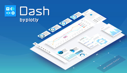
Introducing Plotly
Thankfully, Plotly comes to the rescue. It is a Python library that provides the ability to create beautiful and interactive data visualizations.
The library is also provided for R and Javascript and is written on the basis of the very popular Javascript visualization library d3.
More than Visualizations – Dashboards
Plotly is all nice but why stop there? You can learn to build awesome-looking, interactive dashboards with the use of the Dash framework.
Dash is written on top of Flask, Plotly.js, and React.js, but the beauty of it is that you don’t have to know what any of these means in order to use it.
Using Dash and the Plotly plots it provides you can create awesome interactive data visualizations and data dashboards in Python in no time while writing nothing more than Python code!
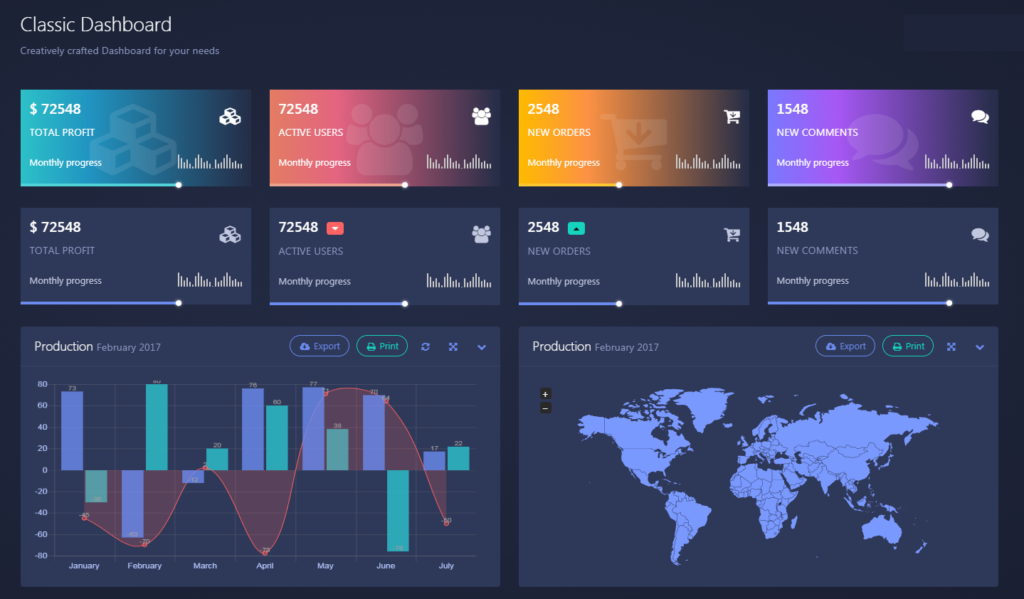
Why Dashboards?
I can already hear you asking. Why learn to create a dashboard in the first place? Well, I would like to give you three solid reason to pay more attention to data dashboards:
- They can help you automate your own analysis and become a tool to help you understand the data you are working with.
- They can summarize your results and help you communicate them easily to others.
- They can serve as the product you provide to your customer or even be the main product of your own company. After all, Software as a Service (SaaS) is a thing, right?
My tutorial
If you are eager to get started with Plotly and Dash I have myself created a tutorial on Jupyter Notebook that I have uploaded on Github. It’s the same notebook I used for giving a hands-on tutorial to my colleagues at the PDEng program Data Science that I am a part of.
You can find the code of the tutorial on Github here. In it, I go through the necessary steps to understand Plotly and Dash as fast as possible and start building dashboards and interactive data visualizations yourself fast.
I have also added some tips on HTML/CSS that helped me when I started out. However, if you want to delve deeper and understand more I have you covered.
Udemy Online Course
There is an awesome online course that I followed and helped me to start out by Jose Portilla, whose course on Python for Data Science and Machine Learning I already reviewed in a previous post.
This course is fantastic as well and takes you step by step so I would certainly recommend it if you are starting out.
==>Check the Udemy Plotly and Dash Course on Python here<==
Note: This is an affiliate link. It helps me run this website at no additional cost to you. If you don’t want to feel free to use another link to get to the course. Thanks!

Resources
Finally, some helpful additional resources I recommend for Plotly and Dash are:
-Plotly/Dash Documentation https://dash.plot.ly/
-Udemy Course https://www.udemy.com/course/interactive-python-dashboards-with-plotly-and-dash/ (affiliate link)
-My tutorial on Github: https://github.com/amChristonasis/Dash-Plotly-Dashboards-Tutorial
-A collection of awesome Dashboard Examples with Code: https://github.com/ucg8j/awesome-dash
Conclusion
I hope you found today’s post useful and hopefully understood the importance of interactive data visualizations and dashboards.
If you have any comments or questions I would love to read them below.
Also, be sure to follow me on social media (links in the sidebar) or contact me directly here.
Cheers,
Antonios
I wanted to become a certified web developer and recently I enrolled in an online course in Udemy that’s hosted by Framework media. While browsing for other courses, I glanced upon several courses that are labeled “python” and got me interested. I was thinking of exploring those courses too like I did with HTML, CSS and Javascript. I searched online for other resources and landed in here. It looks like more complicated than what I have expected before, but since I got this determination to learn this new programming language, I will push through. Can I count for your coaching?
Hey! Glad to see a web development enthusiast here. Udemy is indeed one of my favorite platforms to learn about coding and web development. I am also now starting to learn more about Javascript, CSS, and such, doing Andrei Negaoie’s course –> The Complete Web Developer in 2020: Zero to Mastery. Regarding Python, be sure to reach out if you need any help, sure! Especially in the Data Science/Machine Learning domain! Cheers!